BBillboard
On the street
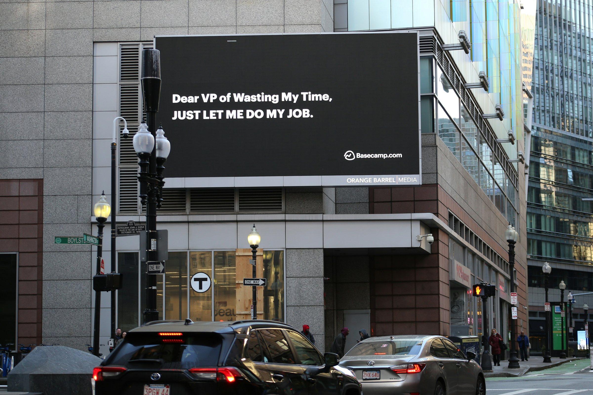
The same idea at street scale: a short headline, a large logo and one line of support, set onto a real billboard face in perspective.
More places.
More possibilities.
Find wheelchair-accessible transportation for the places you want to go, across Seattle and King County.
wavride.org
More places.
More possibilities.
Find wheelchair-accessible transportation for the places you want to go, across Seattle and King County.
wavride.org
COrdering in the app
In hand
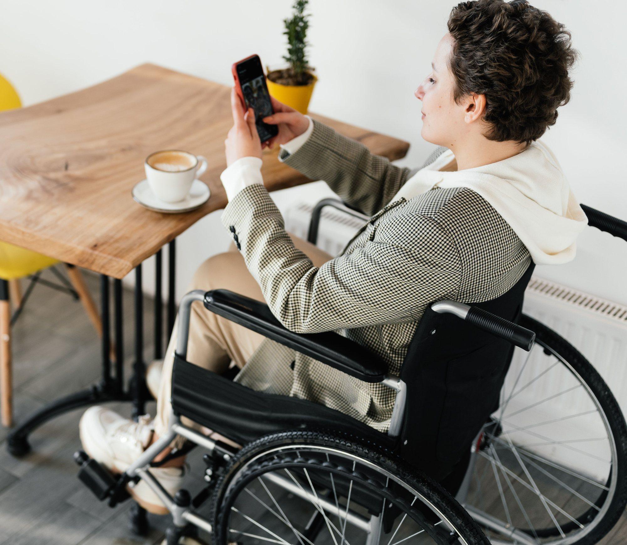
An everyday moment: ordering a ride over coffee. The phone in the photograph shows the live app screen, with her fingers kept in front of it.
- 1Tell us where you're going
- 2Local fleets send you offers
- 3Choose one. Pay in the vehicle
DApp close-up
In the app
Selected screens from the passenger flow (WAV Flow v2), rebuilt as live components. The placeholder branding is replaced by the selected logo.
The first moment of the app: the logo on the primary colour.
Prices, provider, driver, vehicle and timings are demonstration data, not live availability.
EWebbooker
On the web
A desktop adaptation of the same booking model: pickup, destination and one clear action. Rides are for now, in a wheelchair-accessible vehicle, paid in the vehicle.
Wheelchair-accessible rides across King County
Request a wheelchair-accessible vehicle. Local fleets send you offers and you choose one.
- Wheelchair-accessible vehicles only
- Payment is taken in the vehicle
- 1Tell us where you're going
- 2Local fleets send you offers
- 3Choose one. Pay in the vehicle
FVehicle sticker
On the road
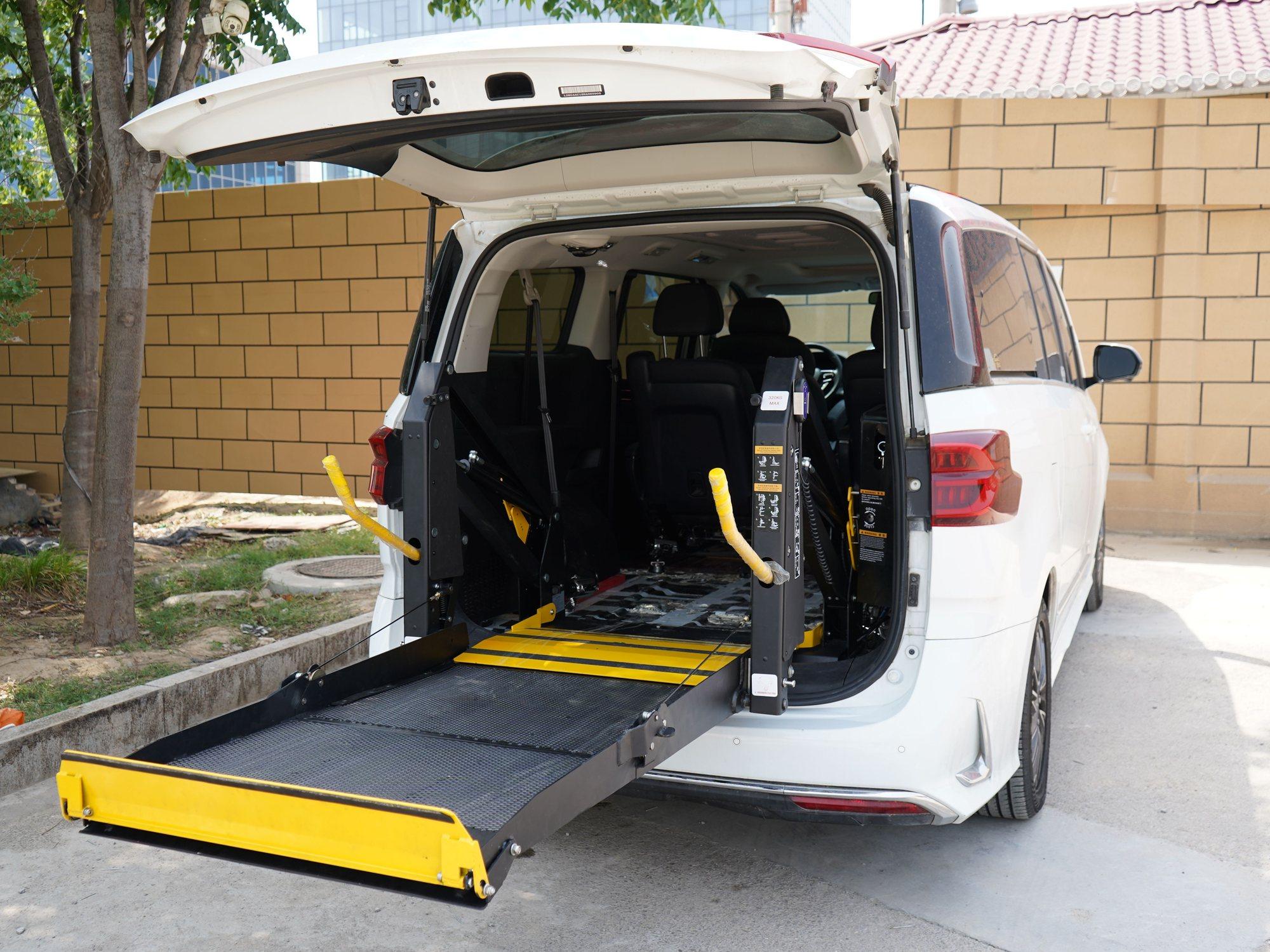
A circular sticker on the rear body panel of a wheelchair-accessible minivan, clear of the lights, plate area and the lift's own labels.
Wheelchair-accessible ride
wavride.org

Wheelchair-accessible ride
wavride.org
Decision support
Compare options
Two options side by side on the same photograph, copy, layout, scale and palette. Only the logo changes.
Side-by-side comparison opens when a second option has artwork.
Option 1 has artwork so far; 3 options are awaiting artwork. Meanwhile, the logo checks below show how the available artwork holds up on light, dark and one-colour backgrounds.
Option 1: logo checks
Your review
Which identity looks strongest in the real world?
Your preference and notes are saved only in this browser on this device. Nothing here is sent to the project team. To share your view, download the summary or send it yourself.
Preferred option
No preference marked yet. You are viewing Option 1.
The review link shares the logo option and colours only. Notes are never added to the link.
ASocial advertisement
In the feed
A 4:5 portrait advert, shown as clean creative and as it appears in a phone's feed. Every element apart from the photograph is live.
More places.
More possibilities.
Find wheelchair-accessible transportation for the places you want to go, across Seattle and King County.
More places.
More possibilities.
Find wheelchair-accessible transportation for the places you want to go, across Seattle and King County.
WAVRide Find wheelchair-accessible transportation for the places you want to go, across Seattle and King County.